
Bringing Turner's World to Life: The Art of Colour and Texture in Animation

When embarking on a project as significant as The Turner Project, a collaboration with the esteemed Tate, the initial excitement often revolves around the techniques. For us at Plume Films, that certainly included the meticulous rotoscoping and the delicate dance of movement that brought J.M.W. Turner's sketches to animated life. But once those core concepts were singing, our focus shifted to two equally crucial heroes: colour and texture. It’s in these subtle layers that true visual harmony is found, transforming animated figures from mere outlines into integral parts of a richly imagined world.
Crafting the Feel: The Role of Texture
For The Turner Project, we weren't just creating moving images; we were striving to evoke the very essence of Turner's era and his artistic process. Our aim for texture was to create a visual experience that felt instantly comfortable and familiar to the audience, complementing our animated subjects without overpowering them. We found our perfect playground in the subtle inflections and shadows offered by parchments, paper, and ink washes.
Think of the delicate, aged feel of an old sketch, or the way a watercolour bleeds subtly into the paper. This approach allowed us to give our characters form in a beautifully two-dimensional way, which, quite remarkably, harmonised wonderfully with the inherently vivid 3D aesthetic of rotoscoping. It’s a bit like having your cake and eating it too – the fluidity of rotoscoping combined with the timeless tactility of traditional art materials. This thoughtful layering of textures ensured our animations felt grounded and authentic, our reflection of Turner's original vision.
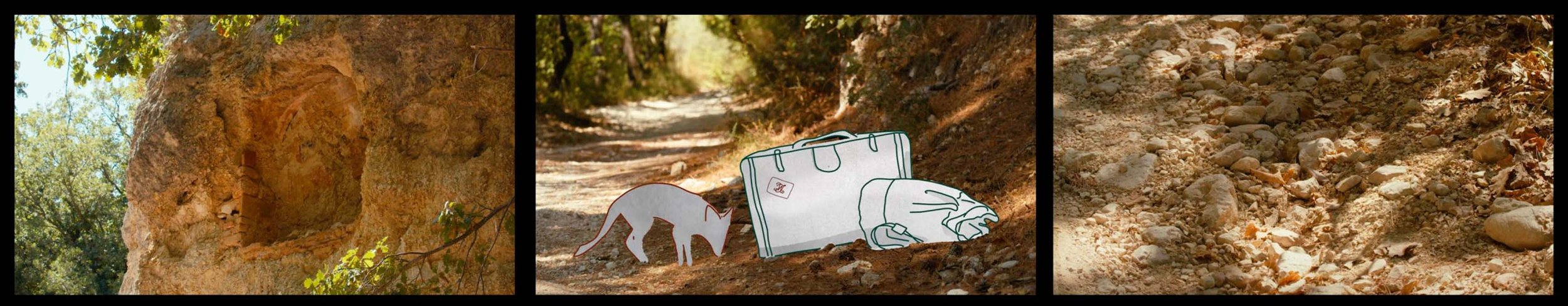
The Subtle Power of Colour: Line Work and Washes
Our colour palette for the line work in The Turner Project was intentionally very limited. We opted for understated inflections of colour, present enough to add definition but designed not to be consciously noticed by the viewer. This deliberate restraint allowed the intricate details of the rotoscoping to shine through, preventing any visual clutter.
However, the main task, and arguably the most artful, was applying a colour wash to the entire form of our animated subjects. This wasn't a simple fill; it involved extensive layering and a delicate dance with opacities to meticulously build up depth. Imagine painting with light and shadow, not just solid hues. We spent considerable time experimenting, refining, and finessing each layer to ensure the washes created a nuanced, living presence for our figures. We feel the most profound visual impact comes from the most carefully considered, subtle touches.

Dancing with the Graders: Achieving Visual Harmony
One of the paramount goals for us was to ensure our animated work achieved absolute harmony with the film's striking and beautiful colour grade. The grading team, true masters of their craft, did a superb job, establishing a truly defined personality for the entire film. It had this wonderful, evocative feel, reminiscent of a vintage postcard with its rich, saturated colours and exquisite shadows.
Now, imagine our rotoscoped subjects simply appearing in stark black and white within this vibrant, richly textured world. They would have looked, frankly, a bit ghostly – disconnected and out of place. This simply wouldn't do for a project aiming to immerse viewers in Turner's evocative landscapes. So, we experimented. We played with light, muted blues and browns, allowing them to subtly dance across the figures almost like dappled sunlight filtering through leaves. It wasn't about making them overtly colourful, but about infusing them with just enough warmth and resonance to feel intrinsically part of the film's established visual language.
Naturally, as with any truly collaborative and iterative process, adjustments were necessary as footage returned from the graders. The snow scenes, in particular, presented a delightful challenge. They had this beautiful, almost turquoise colouring, requiring us to re-evaluate and refine our initial colour choices. It was a precise, meticulous process of ensuring our subjects sat perfectly within that unique, cool environment, complementing rather than clashing with its distinct character.
A great deal of thought, experimentation, and careful consideration went into every brushstroke and every pixel of this process. We sincerely hope that the compelling visual harmony we strived for shines through, creating an immersive and enriching experience for all who watch The Turner Project.

Learn more about The Turner Project on our dedicated page:https://www.plumefilms.com/turner. If you're curious about our diverse range of projects, do have a gander at our portfolio. Or, if you have a project in mind, why not drop us a line? We'd love a chat over a cuppa.